At the weekend, I spent some time wandering around Waterstones and a branch of W H Smith fingering my way through various books, manuals, magazines and newspapers. While I have a draft of my adventure module that stills demands attention, I admit to have become side-tracked with the business of layout.
I have been working on The Stench of the Sea as a boring old Word document. I’m looking to reformat into something slightly more appealing.
Ideally, it should appeal to the reader, but if it appeals to me while I’m expanding, contracting and generally proofing, all the better. I’m not 100% fixed on what sort of layout I’m after, thus the scouting effort. For the moment, the scope seems to mean a varied combination of columns, pictures, slightly differing typefaces for headers, descriptions and read aloud text… that sort of thing. I want to create something more eye-catching than blocks of text without, at the same time, overloading the reader.
I definitely benefited from scouting around. Some magazines and books just seem to get it right in a way that inspires. I find it rather like visiting a stately home, a historic monument, or a particularly good supermarket – something about the place engages all my creativity or froths up my enthusiasms. Before I know it, hours have slipped away and I’m still wandering around with the giddy look of a kid in a sweetshop / candy store.
I got plenty of ideas, taking notes and snapping pictures with my phone. I purchased a couple of magazines as well and have rooted through the piles of reference material already at home. Since the weekend, I have taken to a bit of free hand sketching…
I can’t explain my fascination with the idea of recycling old books by re-using them as notepads, but I do it nevertheless. I could do with a few more printing off-cuts really – I’m sure there must be aberrations of the printing process that end up getting pulped that I’d like to use as is. I have rooted around in bookshops, budget stores and bargain basement outlets, but never find what I’m after. As I’ve noted, I suspect what I’m after never makes it any further than the warehouse, the misprinted volumes quietly skipped and sent off to the pulper.
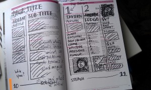
Here, in the attach picture, I’m using the 2009 Full-time Undergraduate Prospectus for Manchester Metropolitan University to sketch out a layout I plan to use in The Stench of the Sea adventure module. I must admit to there being something hugely satisfying about scribbling aimlessly with a black Sharpie on a page already filled with text…
Somewhat related articles
Discover more from JUST CRUNCH
Subscribe to get the latest posts sent to your email.


